Friday, January 17, 2014

PulteGroup, Inc. (NYSE: PHM)
+stock+chart.png)
Please take a look at the 1 yr. chart of PHM (PulteGroup, Inc) that I have shown below with my added notations:
PHM has formed a very nicely defined upchannel over the last (3) months. A channel is simply formed through the combination of a trend line support that runs parallel to a trend line resistance. When it comes to a channel any (3) points can start the channel, but it’s the 4th test and beyond that confirm it. You can see that PHM has multiple test points between the channel resistance (green) and the channel support (blue). Following the PHM channel can provide you with both long and short trading opportunities.
The Tale of the Tape: PHM has formed a common chart pattern known as a channel, in this case, an up-channel. A long opportunity could be entered on a pullback to the channel support, which is currently sitting near $18.50. Short trades could be entered at channel resistance OR if PHM were to break below the channel support.
Please share this article
JIM ROGERS 2014 PREDICTIONS - Global FOOD PRICES to RISE, GOLD MANIPULATION, CHINA & more
Please share this article
McAlvany Weekly Commentary
Does Money Grow on Trees? – QE failure
Posted on 15 January 2014.
About this week’s show:
-Drew talks about heading back to Europe
-Abenomics could be an economic Fukushima
-Political lies: Employment, Inflation & Growth
-Gold Hoard in Europe – Listen Here
-Gold Hoard in Europe – Listen Here
-Gold Hoard in Europe PDF – Click Here

 Read | Subscribe@iTunes
Please share this article
Chart of the Day - NCR Corp (NCR)
.png)
They provide Relationship Technology solutions for the retail, financial, communications, travel and transportation, and insurance markets. NCR's Relationship Technology solutions include privacy-enabled Teradata warehouses, ATMs and store automation. The company's business solutions are built on the foundation of its long-established industry knowledge and consulting expertise, value-adding software, global customer support services, a complete line of consumable and media products, and world-leading hardware technology.
Please share this article
Thursday, January 16, 2014
Baltic Dry Continues Collapse - Worst Slide Since Financial Crisis
Despite 'blaming' the drop in the cost of dry bulk shipping on Colombian coal restrictions,
it seems increasingly clear that the 40% collapse in the Baltic Dry
Index since the start of the year is more than just that. While this is
the worst start to a year in over 30 years, the scale
of this meltdown is only matched by the total devastation that occurred
in Q3 2008. Of course, the mainstream media will continue to ignore this
dour index until it decides to rise once again, but for now, 9 days in a row of plunging prices is yet another canary in the global trade coalmine and suggests what inventory stacking that occurred in Q3/4 2013 is anything but sustained.
Baltic Dry costs are the lowest in 4 months, down 40% for the start of the year, and the worst start to a year in over 30 years...

As we noted yesterday...
Of course, we are sure the 'lead' that the Baltic Dry seems to have over global macro will be quickly ignored...

Please share this article
Baltic Dry costs are the lowest in 4 months, down 40% for the start of the year, and the worst start to a year in over 30 years...

As we noted yesterday...
Of course, we are sure the 'lead' that the Baltic Dry seems to have over global macro will be quickly ignored...

Please share this article
Palladium: My Favorite Chart Setup For 2014
I’ve spent the last couple of weeks really digging into my chart
book. Many of you guys already know, but I look at more charts on more
time frames than you can ever imagine. The way I see it, if you put in
the work, there is always a good risk/reward out there, whether on the
long side or short side, stock, currency, or commodity. It doesn’t
matter to me whether we’re buying Microsoft or Coffee futures. To me
it’s just supply and demand, so what’s the difference?
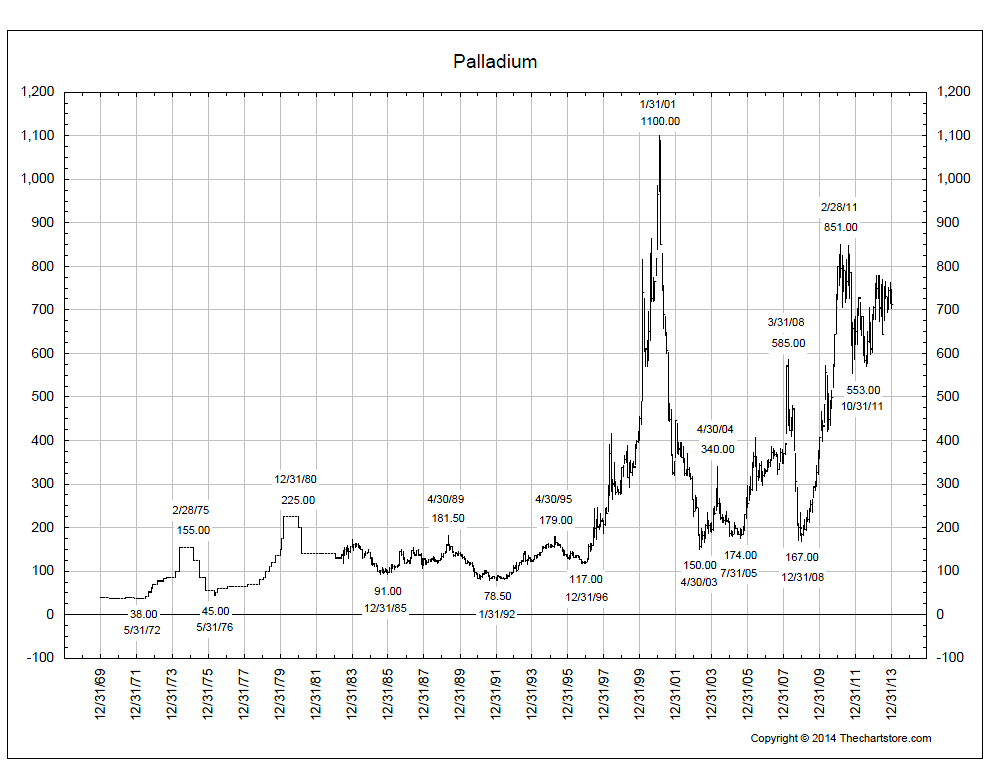
There is one chart that really really stands out to me. And that is the weekly chart of Palladium. I’ve briefly mentioned it before, but I think it’s worth bringing up again as we enter the new year. First let’s get some perspective. This is a long-term arithmetic scale bar chart of Palladium prices going back to 1969. It’s brought to us by thechartstore.com and shows the all-time highs in 2001 up towards 1100. That’s currently 50% above today’s prices. I like that, it gives us plenty of room. But also notice this pattern of converging trendlines that’s developed over the last couple of years since that 2011 decline:

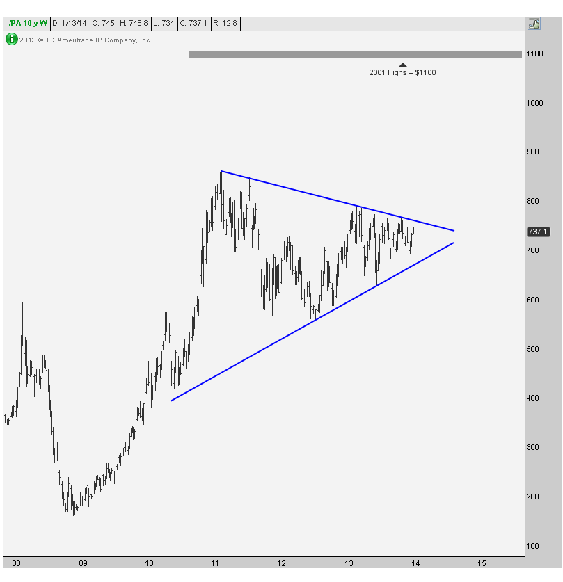
Here is a better look at what I’m talking about. This is a weekly bar chart giving us a closer look at these converging trendlines. You see, more often than not, these sort of consolidations tend to resolve themselves in the direction of the underlying trend. In this case, the trend is up since 2008 and this action is correcting the initial 400+% rally that got it here. The measured move based on this pattern takes us above 1200, so to think we can retest the all-time highs is not out of the question at all.
 One last thing that I’d like to mention is how many times this
downtrend line has been tested. Depending on your count, we could be
talking about 5-6 tests of resistance. In my experience, the more times
that a level is tested, the higher the likelihood that it breaks. I
think it happens soon and our confirmation would be when prices take out
last year’s highs. Depending on your time frame and risk parameters you
can wait or anticipate it. In my opinion, as nice as this might be, I
don’t think there’s any reason to rush it. This is such a humongous
base, that the upside potential on a breakout is massive and we’ll have
plenty of time to participate.
One last thing that I’d like to mention is how many times this
downtrend line has been tested. Depending on your count, we could be
talking about 5-6 tests of resistance. In my experience, the more times
that a level is tested, the higher the likelihood that it breaks. I
think it happens soon and our confirmation would be when prices take out
last year’s highs. Depending on your time frame and risk parameters you
can wait or anticipate it. In my opinion, as nice as this might be, I
don’t think there’s any reason to rush it. This is such a humongous
base, that the upside potential on a breakout is massive and we’ll have
plenty of time to participate.
There is one chart that really really stands out to me. And that is the weekly chart of Palladium. I’ve briefly mentioned it before, but I think it’s worth bringing up again as we enter the new year. First let’s get some perspective. This is a long-term arithmetic scale bar chart of Palladium prices going back to 1969. It’s brought to us by thechartstore.com and shows the all-time highs in 2001 up towards 1100. That’s currently 50% above today’s prices. I like that, it gives us plenty of room. But also notice this pattern of converging trendlines that’s developed over the last couple of years since that 2011 decline:
Here is a better look at what I’m talking about. This is a weekly bar chart giving us a closer look at these converging trendlines. You see, more often than not, these sort of consolidations tend to resolve themselves in the direction of the underlying trend. In this case, the trend is up since 2008 and this action is correcting the initial 400+% rally that got it here. The measured move based on this pattern takes us above 1200, so to think we can retest the all-time highs is not out of the question at all.
And that’s not to say there aren’t other beautiful charts out there. I think the weekly $USDCAD chart, for example, is gorgeous and breaking out of this multi-year base. But I bring up palladium as a setup. Like I said, it’s not ready to trade yet. But coming into the new year, I think this one could be a monster. We’ll see…
Please share this article
Subscribe to:
Posts (Atom)