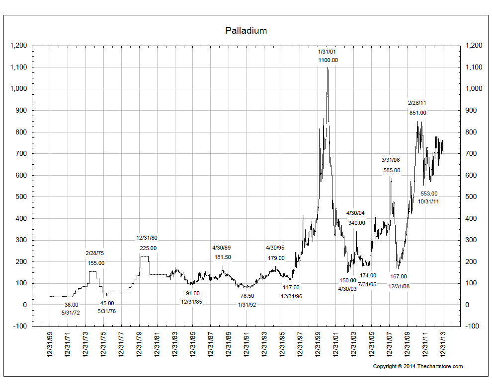
There is one chart that really really stands out to me. And that is the weekly chart of Palladium. I’ve briefly mentioned it before, but I think it’s worth bringing up again as we enter the new year. First let’s get some perspective. This is a long-term arithmetic scale bar chart of Palladium prices going back to 1969. It’s brought to us by thechartstore.com and shows the all-time highs in 2001 up towards 1100. That’s currently 50% above today’s prices. I like that, it gives us plenty of room. But also notice this pattern of converging trendlines that’s developed over the last couple of years since that 2011 decline:
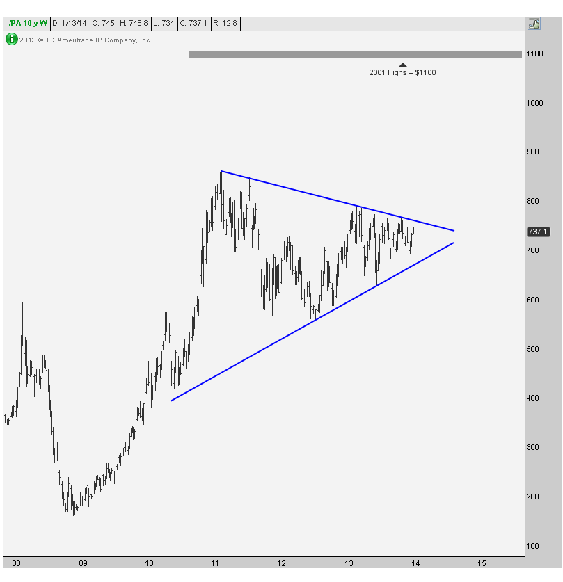
Here is a better look at what I’m talking about. This is a weekly bar chart giving us a closer look at these converging trendlines. You see, more often than not, these sort of consolidations tend to resolve themselves in the direction of the underlying trend. In this case, the trend is up since 2008 and this action is correcting the initial 400+% rally that got it here. The measured move based on this pattern takes us above 1200, so to think we can retest the all-time highs is not out of the question at all.
And that’s not to say there aren’t other beautiful charts out there. I think the weekly $USDCAD chart, for example, is gorgeous and breaking out of this multi-year base. But I bring up palladium as a setup. Like I said, it’s not ready to trade yet. But coming into the new year, I think this one could be a monster. We’ll see…
Please share this article
No comments:
Post a Comment