Tuesday, September 23, 2014

Death-Crossed Russell Suffers Biggest 2-Day Plunge In 5 Months


Death crosses; Hindenburg Omens; PBOC, BOJ, and ECB hinted at removing the punchbowl; crappy US housing data; and a Chinese IPO takeout hangover weighed on stocks with Russell 2000 the biggest loser (suffering its biggest high-to-low drop from Friday in over 5 months). The Dow is the only index holding post-FOMC gains (Russell down over 2%). Homebuilders are now down 4% from last week’s FOMC statement, post-FOMC high-flyer financials have tumbled red (catching down to credit), and only safe-haven healthcare is holding any gains post-FOMC (Biotech -3%). Treasury yields fell led by the short-end (3Y -3.5bps, 10Y -2bps) back under FOMC levels. The USD recovered European session losses to end almost unchanged as considerable AUD and CAD weakness outweighed GBP strength. Despite being clubbed like a baby seal in Asia, Silver rebounded through the day to end -0.3%, gold unch, oil down, and copper -1.6% as China stimulus hopes faded. S&P 500 lost 2,000; Russell is down 2.6% year-to-date (-6.8% from July highs); VIX jumped most in 2 months to ~14. BABA pinned at $90, HLF smashed -10%.
READ MORE
Please share this article

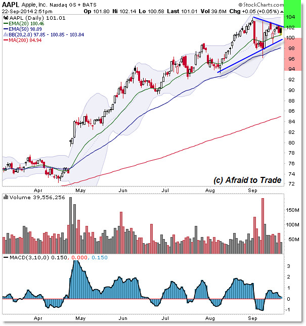
Triangle Trade Setting Up in Apple AAPL

With all the attention focused on the iPhone 6 this weekend, traders may be missing an iTriangle Pattern forming on the stock chart of Apple (AAPL) shares.
Let’s take a look at the Classic Chart pattern, note the boundaries, and trading tactics we may use as this pattern develops.

Shares continue a strong bullish uptrend as evidenced by higher price highs and higher price lows.
We also observe the most bullish orientation possible in the moving average structure of price in the trend. (more)
Please share this article

What Is the VIX Fear Index Telling Us Now?

Supply and Demand

When you get down to brass tacks, asset prices are governed by supply and demand. In the markets, the conviction of buyers relative to the conviction of sellers also plays a major role. Therefore, “I am confident” vs. “I am nervous” ratios can help us monitor and manage investment risk. What is the market telling us now?

Confident vs. Nervous

One confident vs. nervous ratio, the S&P 500 relative to the VIX, is shown below. When the ratio was pushed back at resistance (see point A), weakness in stocks followed (bottom of chart). Conversely, when the ratio cleared resistance (point B), good things happened in the stock market. Last Friday (before the FED), the ratio was revisiting the horizontal blue line, meaning it was at a possible inflection point (see point C).
READ MORE
Please share this article

Emerging Markets Break 2014 Uptrend Line

One of the standout losers to start the week has to be Emerging Markets. We’ve been watching this space closely ever since the failed breakout to new 52-week highs earlier this month. Whenever we see those, the opportunities that develop can provide us with very favorable risk/rewards.
Today we are going to focus on the daily bar chart of $EEM which is the iShares ETF that represents the MSCI Emerging Markets Index. This Index has heavy exposure in China (17%), South Korea (15%) and the rest in places like Taiwan (12%), Brazil (10%), South Africa (7%), India (6%), Russia (5%), Mexico (4%), etc.
Take a look at the failed breakout earlier this month. This is just another one of the million examples of the fast moves that come from failed moves. The problem that I see here is that not only are we entering the week breaking the uptrend line from the 2014 lows, but also key support from the lows in June and August:
9-22-2014 eem daily bars
Notice the bearish divergence in momentum as RSI failed to confirm any of the new highs in price throughout the summer. Momentum was warning us of a problem, and prices now seem to be confirming. I would say that to invalidate any of this negative action, I would want to see prices rally back above 43.50 without RSI reaching oversold conditions. But other than that, it looks like lower prices are coming. (more)
Please share this article

PowerSecure International, Inc. (NYSE: POWR)

PowerSecure International, Inc. provides products and services to electric utilities and to their commercial, institutional, and industrial customers in the United States. It offers interactive distributed generation power systems, smart grid monitoring for electric utilities, peak shaving and demand response, and standby power dispatch and control solutions; PowerSecure solar distributed energy systems; and switchgear products and systems under the NexGear brand name.
Take a look at the 1-year chart of PowerSecure (NYSE: POWR) below with my added notations:
1-year chart of PowerSecure (NYSE: POWR)
Back in May POWR took a massive hit, falling from $20 down to $7 in two days. Since that time the stock has slowly rebounded up to a high of around $12. During the rebound POWR created a key level at $10 (green) and an obvious resistance at $12 (red). The stock will eventually break one of those two levels, and that break will most likely dictate POWR’s next short-term move.

The Tale of the Tape: POWR has key levels to watch at $10 and $12. Long trades could be considered at $10 or on a break through $12. Short trades could be made at $12 or on a break below $10.
Please share this article