Gerald Celente - Tommy Schnurmacher Show - CJAD- 09 Nov 2011 : Gerald Celente was always ahead of his time in fact he predicted amongst other things the OccupyWall street movement and the gold bull run , regarding China Gerald Celente says "as gos United States and Europe so Goes China " " and as china goes so does Chile and Brazil and all these countries supplying natural resources , this whole thing is connected" the rich Chinese those who have money and know how to get their money out are going to other countries says Gerald Celente , China has 1.3 billion people and a million problems they have to keep this thing going ad if the United States and the Europeans do not consume the Chinese do not sell , this is global destabilization taking place ......people do not react to something until it hits bottom and that's what has happened now bottom was hit ..
Friday, November 11, 2011
Gerald Celente : China has 1.3 billion people and a million problems
Gerald Celente - Tommy Schnurmacher Show - CJAD- 09 Nov 2011 : Gerald Celente was always ahead of his time in fact he predicted amongst other things the OccupyWall street movement and the gold bull run , regarding China Gerald Celente says "as gos United States and Europe so Goes China " " and as china goes so does Chile and Brazil and all these countries supplying natural resources , this whole thing is connected" the rich Chinese those who have money and know how to get their money out are going to other countries says Gerald Celente , China has 1.3 billion people and a million problems they have to keep this thing going ad if the United States and the Europeans do not consume the Chinese do not sell , this is global destabilization taking place ......people do not react to something until it hits bottom and that's what has happened now bottom was hit ..
29% of Mortgages Are Underwater
MSNBC – Nearly 29% of mortgaged homes underwater
A whopping 28.6 percent of homeowners with mortgages owe more on their loans than their homes could sell for, according to quarterly data released Tuesday by Zillow, a real estate website. That’s up from 26.8 percent in the second quarter. Home values declined only 0.2 percent from the second quarter but were down 4.4 percent year over year. The rising percentage of homes with “negative equity” or “underwater” status is due largely to how long the foreclosure sale process takes rather than home value fluctuations, said Zillow chief economist Stan Humphries. Prior to the “robo-signing” scandal around foreclosures that came to light in 2010, the negative equity rate hovered in the 21 to 23 percent range, but has been in the 26 to 28 range since due to added delays in foreclosure sales. While the rate of foreclosures is dropping, the time required for foreclosures to sell has lengthened. “We’re in uncharted waters,” Humphries said in an interview. “More than one in four homes underwater and about 9 percent unemployment is a recipe for more foreclosures.”
USA Today – Foreclosure backlogs could take decades to clear out
Foreclosure sales are moving so slowly in half the states that at the current pace, it will take more than eight years on average to clear the 2.1 million homes in foreclosure or with seriously delinquent mortgages, new research shows. That’s about twice as long as a year ago in the states where foreclosures go through courts — before the mortgage industry was upended by last fall’s disclosures that court papers in many foreclosure cases were improperly prepared. Since then, new checks have slowed the process. The backlogs suggest that the fallout from the nation’s worst housing-market collapse is likely to weigh on real estate prices in many markets for years to come, and on some markets for longer than on others.
Comment: According to Census data, a total of 76.428 million owner occupied units existed in the U.S. as of 2009. Of those, 50.3 million currently had a mortgage on their property.
Recently, Core Logic estimated that 22.5% of all homes in the U.S. were underwater and another 5% had near negative equity. Additionally, JP Morgan has estimated that 27% of all foreclosures are walkaways.
Zillow’s estimates offer another data point on mortgages, suggesting nearly a third of all homes are now underwater.
Top 3 Highest Yielding ETFs: PSP, REM, HYG
High Yield ETfs offer many advantages, they hold well diversified portfolio, they are cost effective and liquid -easy to trade. To screen for the highest yielding ETFs, one must be careful to only screen for ETFs that have a low spread, or high volume that way they are not giving up any yield to the transaction spread. Below is a list of the 3 Highest Yielding ETFs with over 100,000 in daily average volume.
Powershares Global Listed Private Equity(NYSEArca:PSP - News) tries to relicate before fees and expenses) to the price and yield of the Red Rocks Global Listed Private Equity IndexSM. This ETF currenly has a 11.38% dividend yield and has an expense ratio of 0.70% The top holding in this ETF is Leucadia National.
ishares FTSE NAREIT MG REIT Index (NYSEArca:REM - News) seeks to generate returns that correspond FTSE NAREIT All Mortgage Capped Index. This ETF has a 11.04% yield and an expense ratio of 0.48%. The top holding in the ETF is Annaly Capital Management.
SPDR Barclays Capital High Yield Bond (NYSEArca:HYG - News) seeks to relicate the performance of the iBoxx Liquid High Yield Index. This ETF currently yield 7.15% and has an anuual expense ratio of 0.50%. The top holding in this Lyondell Chemical 11%.
How The Euro Could Trigger A 2008-Style Crash In One Chart
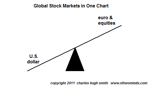
If we dispense with all the fancy stuff, we end up with a simple see-saw with the euro and global equities on one end and the much-hated U.S. dollar on the other.
If we scrape away the ever-hopeful headlines predicting a new figurehead lackey or another vote will magically fix Greece, Italy, the euro, Europe's crumbling banks, etc., the global stock markets can be distilled down to one chart. And here it is: a see-saw with the U.S. dollar on one end and the euro and equities on the other.
I know the mind rebels at such simplicity, and so does the entire buy-side Wall Street edifice: if it all boils down to this, then there really isn't much value added by the endless reams of fancy reports and analysis, is there?
But let's presume for a moment that it really is this simple. Where does that leave global stock markets? The answer can be had by glancing at two other charts: one of the euro and one of the dollar.
Now that the cargo-cult chiefs are openly talking about the euro splintering into euro 1 and euro 2 (i.e. business class and steerage), something I proposed as a possible "face-saving" step in the devolution of the euro 18 months ago ( Why the Euro Might Devolve into Euro 1 and Euro 2 March 2, 2010), then the common-sense question is: why is the euro worth 36% more than the dollar? The answer is that it isn't worth 36% more, of course, and for a bit of technical support of that we turn to a simple chart.
There's not much to support Bulls' claims of euro strength here and much to suggest the euro is in a leaky barrel floating helplessly toward Niagara Falls. Classic wedge broken decisively to the downside, check. Uptrend decisively broken, check. RSI declining but not oversold, check. MACD declining and below the neutral line, check. Price below the critical 200-week moving average (MA), check. Price below the equally critical 50-week MA, check.
The last time these conditions occurred (April 2010), the euro cliff-dived from right where it is now around 136 to 120 in a few weeks. Technically, there are numerous reasons to consider this a high-probability scenario and essentially no support for the notion that the euro is about to storm higher.
And as the euro goes, so go equities.
Meanwhile, the chart of the dollar is unsurprisingly the inverse of the euro: it's loaded with bullish bits. RSI rising, check. MACD rising and above the neutral line, check. Classic wedge broken to the upside, check. Downtrend decisively broken, check. Classic A-B-C-D pattern visible, check. Price above the critical 50-week moving average, check.
In another classic move, price kissed the 200-week MA, retraced to support, and is now rising back to break through the resistance offered by the 200-week MA.
Without getting too fancy, the obvious targets for the euro are 120 and parity with the dollar at 100. This could also be seen as reversion to the mean. The targets for the DXY (dollar index) are correspondingly 88-90 and 100-105.
As for what this means for equities, it's a free-for-all limbo dance: how low can you go? The S&P 500, currently around 1,240, could easily limbo down to the psychological 1,000 level, pause to towel off the sweat and then repeat its 2008 swan dive to 666. Or maybe not. The only thing the see-saw tells us for certain is the euro and equities are on one end and the dollar is on the other. If the euro tanks, equities tank, too.
I know, I know, the dollar is doomed, it can't possibly rise, blah blah blah. If you insist on a fundamental reason, then read this: banks are short currency, long assets (Zero Hedge).
And what's holding up the euro again? I'm getting a lot of static in the answer.The One Chart That's Worth More than 1000 Analyst Opinions
| |||
| |||
Yields of 13%-Plus from the Best-Performing Asset Class of the Decade: EPD, NKA
One of the most successful high-yield energy investments in the world is a type of security few investors even know exists, let alone own.They aren't stocks and they aren't bonds, but they are the No. 1 performing asset class of the past 10 years -- up 288%. Stocks are up just 31% during that stretch and bonds, which have been in a major bull market, are up 71%.
Many of these companies have raised dividends at an almost 10% annual pace in the past decade. And their prices have also risen, generating total annual appreciation between 15%-20%.
That's why these investments give you the exact same double whammy -- high yields and explosive growth -- that has propelled so many big winners to the top of The 21 Best Income Stocks of the Past Decade I told you about in my previous article.
The companies I'm talking about are called master-limited partnerships -- or MLPs for short -- and they have two overriding characteristics. They are overwhelmingly in the energy business and they usually pay high yields -- 5% to 7% on average... and upwards of 13% for some profitable firms.
What drives the revenue-generating power of these companies is the business they're in.
MLPs are publicly-traded limited partnerships that run critical "midstream" energy infrastructure. That's the pipelines, storage tanks, terminals and ships that move energy from producer to the end-user.
In short, they are the arteries through which our economic lifeblood flows.
And the beauty of MLPs is that while they are energy companies, they are insulated to some extent from price fluctuations in commodities.
For MLPs, it's more about demand. For most of their revenue, it doesn't matter whether oil is at $50 a barrel or $150. As long as the stuff keeps flowing through their pipelines, they profit -- along with their investors.
That's one big reason why MLPs have steadily churned out double-digit total returns year after year, despite volatile commodity prices.
Another reason is because MLPs pay out upwards of 90% of their profits to investors -- making them some of the highest-yielding investments on the planet.
While most investors are drawn to the high yields these businesses throw off, plenty of these companies have also grown impressively, creating sizable capital gains for investors.
For example, Enterprise Products Partners (NYSE: EPD) was launched in 1998. A $10,000 investment back then would now be getting $5,322 a year in distributions -- a 53% annual yield on the initial investment. And that's on top of a capital gain of 149%. Assuming distributions were reinvested, the total gain today would be more than $80,000.
Enterprise is by no means an isolated example. If you're looking for sky-high yields, a quick search shows the top yielder in the group is Niska Gas Storage Partners (NYSE: NKA), which pays more than 13% -- and at least eight other MLPs come close to matching that impressive number.
Now, I'm not saying that MLPs represent a risk-free investment. MLPs tend to deliver steadier results, but they're not without risk.
For example, the Alerian MLP Index -- which is a handy proxy for the major MLPs -- fell sharply in 2008.
Action to Take --> That said, there are some compelling reasons that I think will drive MLPs higher during the next three to five years -- and maybe into the much longer term.
Global demand for energy has been, and continues to be staunch. In fact, we've only seen one decline in annual energy consumption in the past 30 years.
Meanwhile, the spread of production technologies such as directional drilling and hydraulic fracturing have opened huge new sources for oil and gas production from shale formations in the United States. According to industry insiders, the energy being produced from the shale in places such as Eagle Ford in south Texas is already outstripping the available pipeline and storage capacity. This shale boom has led to a big increase in the need for the energy infrastructure that these MLPs provide.
Silver Institute Releases Silver Investment Market Report
Other findings from the report include:
- The outlook for silver prices is bullish for the remainder of 2011 and into 2012;
- Silver investment has become a key area of the global silver supply/demand balance;
- Since the beginning of 2008, global Exchange Traded Fund (ETF) holdings have grown by 364 million ounces (Moz) to 577 Moz on October 31, 2011; and
- This year, a fresh peak of 41 million coins is forecast for the U.S. Mint's American Eagle silver bullion coin sales, eclipsing last year's record of 34 million coins. Globally, bullion coin sales are on target to post another record high.
The report, prepared by Thomson Reuters GFMS, covers several key areas of silver investment, including a market overview, who is investing in silver and why, investment in paper instruments linked to silver, physical investment in western and developing markets, silver mining stocks, and an analysis of privately held silver bullion stocks.
"This update examines how silver's price characteristics, including its safe haven status and price volatility have appealed to different groups of investors, and how they have reacted to price variations, as well as the changing economic backdrop," explained Michael DiRienzo, Executive Director of the Silver Institute. "We believe this report will give silver market participants a fresh look into silver's role as an investment," he added