If you have been following my articles for a while, then you may be tired of my warnings of the bear market, which is on the verge of starting. In fact, the TSX Toronto stock exchange, US Transportation index and the Russell 2000 small-cap index have all been in bull blown bear markets for six months already.
I won’t say we are in a full-fledged bear market until we see the large cap indexes breakdown. Until the S&P500, Dow Jones, and NASDAQ fall below critical support the US stock market is still in an uptrend.
Instead of talking about the all the manufactured strong earning numbers created by share buyback programs, sales being way down for most companies, shipping companies struggling for products to ship, and products and service prices being reduced to help generate sales (deflation), let me share with you some monthly charts that I think paint a simple and clear picture of what is happing in the US stock market.
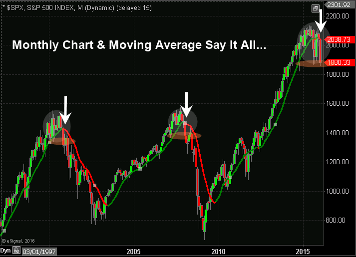
Monthly SP500 Index Trend Chart
The chart speaks for its self, but if you don’t know what you are looking at let me elaborate. Price action in 2015 shows increased volatility, heavy volume selling of shares, few stocks are trending higher each week and now this index is on the verge of breaking through critical support.If the price falls any lower it will trigger an event that will take years to recover from. The event being a bear market that could make the 2001 and 2008 bear markets look not that bad.
What should an investor do?
You have three choices:- Do nothing and suffer the consequences
- Move all your investment capital to cash and just sit on the sidelines for a year or two and let price drop so you can re-enter when prices are at bargain levels dividends are high.
- Employ a strategy to profit from the falling market and possibly double your investment capital within a year or two with a few well-timed trades. This is what I do and share with subscribers of my newsletter.
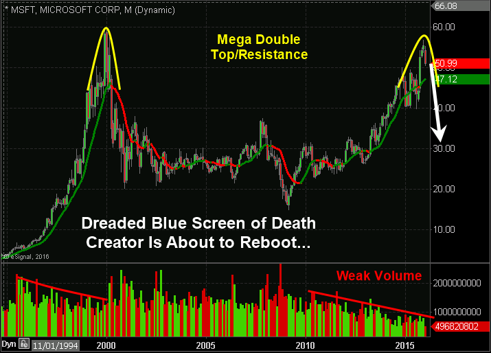
Monthly Microsoft Chart:
I find it interesting that Microsoft shares have been on fire to make near all-time highs during a time with Apple loses its product creator and fails to come out with anything new and exciting.A couple months ago I talked about Apple setting up for a big drop when the price was at $122.xx. Today it's trading at $97 a 21% drop and it looks like we could see another 20% drop from here.
Monthly Toyota Chart:
Toyota shares are just one of the hundreds of stocks setting up for a huge drop. I like this example as it’s a massive double top from 2007 high and has a bearish head & shoulders pattern testing its breakdown level.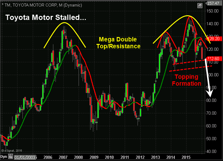
Monthly Tesla Chart:
This was and still is the best stock in the world to many traders, investors and those unique Tesla owners. I say that because I know two men who have Tesla’s and it’s like they are in a cult with their electric cars and think ICE cars are old school (ICE – Internal Combustion Engine). Maybe I am a little jealous because I just bought and ICE car off a Tesla owner in my town and I had the privilege to take it for a drive – WOW it’s weird but AWESOME!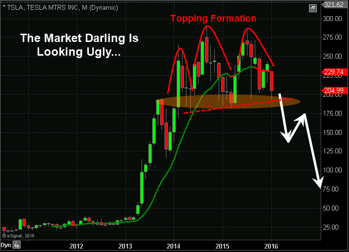
No comments:
Post a Comment