We all have different time frames and risk objectives. That’s
something that rarely gets discussed but is probably the most important
detail of our investing lives that must be defined. In my work, I
incorporate a top/down approach starting with longer-term charts and
work my way down to shorter-term time frames. One of my favorite
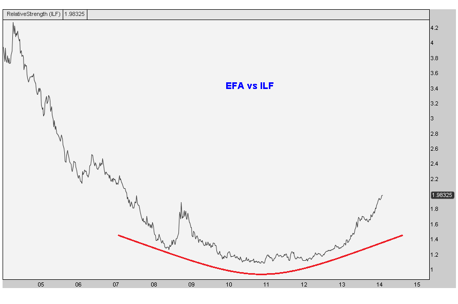
long-term charts is something I coined
“The Chart of the Decade” back in 2012. This is the secular shift out of Latin America and into more developed nations.
This chart represents the MSCI EAFE ETF which consists of large- and
mid-cap developed market equities, excluding the U.S. and Canada (
$EFA) compared with the Latin America 40 ETF (
$ILF). I originally brought this up when prices were first
breaking out of this monster base. But look at how nicely this one has developed (
no put intended):
There are a few things we can take from this. The first one is
obvious: big round bottoms can be very powerful. We’re seeing similar
bases in
$USDCAD as well as in the
Emerging Markets vs S&P500 spread.
The second thing we should be paying attention to is just that, the
underperformance in Emerging Markets. Latin America is just another
example of money flowing out of this emerging space and into more
developed nations. And not just the US, but into Europe and Japan,
especially on a relative basis.
This is a huge secular shift that we’re watching and trying our best
to take advantage of it. Latin America and Emerging Markets as a group
were major outperformers for a long time. This has clearly changed and
based on these huge bottoms, it looks like this trend is probably here
to stay.
Please share this article
No comments:
Post a Comment