Here is a weekly line chart comparing the iShares 20+ yr Treasury Bond ETF ($TLT) and the SPDR S&P500 ETF ($SPY). These are two widely followed proxies for Treasury Bonds and US Stocks. We’re taking this one back 10 years to get a long-term perspective of where we are today:
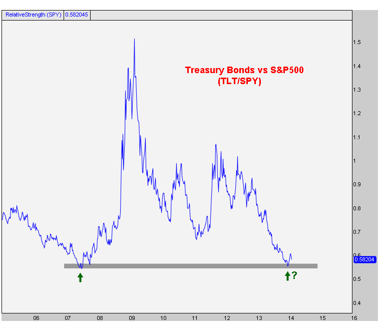
The way I learned it, when a market gets back to a historic support (or resistance) level for the first time, there is market memory there and a reaction typically occurs. In this case, we’re talking about a historic support level where the market reaction would be a bounce higher.
Now, does this have to happen? Of course not. Stocks can continue to rally to all time highs and bonds roll over to new lows. But that seems to be the consensus as I keep hearing on tv and reading on the internets that we’re in a “rising rate environment”. If that’s the case, and consensus is right, then this support should be irrelevant.
But I came into the year very bullish bonds and I continue to believe that bonds trade higher and we are NOT in a rising rate environment. I think rates continue to fall and this chart bounces nicely.
Either way, the risk/reward here seems to be in favor of the bond bulls (stock market bears) by a long shot. And at the end of the day isn’t that all that matters? Finding the best risk/reward opportunities?
What do you think? Should we ignore our supply & demand principles here? Or pay attention?
Please share this article
No comments:
Post a Comment