This is one that doesn’t get a lot of attention. I love that.
When we take a look at metals, whether base or precious, I think it’s
important to start with where the strength is. Here is a one-year chart
of all of your favorite metals: Gold, Silver, Platinum, Copper and
Palladium. There are some others out there like Nickel, Lead and Zinc,
but today we’ll stick with the easiest ones to trade. These are the ones
that I look at most frequently anyway.
Notice the strength in Palladium over the past year. While precious
metals like Gold and Silver have been crushed, down 22% and 31%
respectively, Palladium is dominating the metals market – up 24% over
the last year:
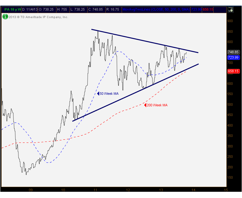
I think this comparison chart is the perfect place to start the
analysis in metals. Now that we know where the relative strength is, we
can look at a price chart of Palladium. It’s not surprising that this
thing looks beautiful on a longer-term timefame. Here is the weekly
chart showing a nice 3-year consolidation after over a 400% move from
the 2008 bottom:
What stands out to me is how symmetrical this consolidation has been.
I love clean charts, and this is one of them. The fact that prices are
trading nicely above rising 50 and 200 week moving averages is further
evidence of strength, both absolute and relative. Pull up the charts of
the other metals, they don’t look like this.
(more)
Please share this article
No comments:
Post a Comment