The first thing you notice is the 13 year cycle of major tops and bottoms that have been put in for the Dow Jones Industrial Average going back to 1974. Currently we’re in the 13th year after a major top was put in during the year 2000. So cyclically, the market is vulnerable according to this chart:
Click chart to embiggen
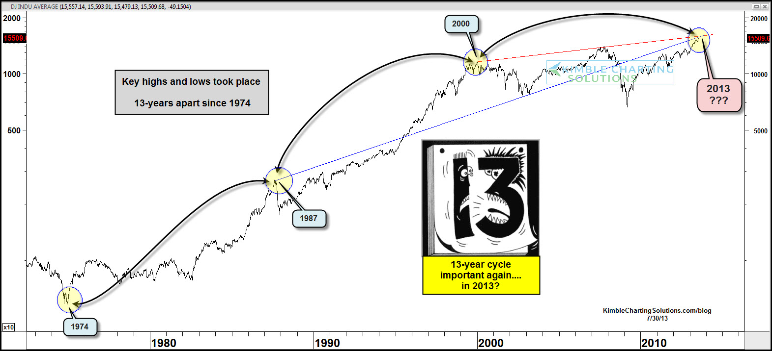
But the two trendlines that go back to the 1987 and 2000 tops are just fascinating.
Make what you will of this chart. Call it a coincidence if you want. But tell me this isn’t the chart of the day?
Please share this article
No comments:
Post a Comment