Thursday, December 11, 2014

Silver Charts in the major currencies

The need to review the global charts on Silver
SilverMOnthly AustralianMonthly CandianMonthly EuroMonthly SterlingMonthly US$Monthly Yen
Here’s what Silver looks like in the major currencies … This is the “Handle” part of the giant “Cup and Handle” you’ll see in the first posted chart.   The first chart is the historical monthly chart showing the spike in 1980 up to the 2011 spike to $49.84 (the day we got everyone out of the Silver Call Options) ….  The other charts point to the “Come to Jesus” moment for the bankers and those short Comex and LBMA Silver contracts once Silver breaks through the resistance lines in a strong manner ….
Two years ago,  I posted the monthly Silver chart,  almost the day before another major bashing came in to bring the prices sharply lower.   I no longer fear the shorts,  because they are cornered more so now than before.   If they are able to do it again,  the handle will indicate a much larger move than it already is predicting.   For now,  a break above the $50 cup rim is a given (imo) with the possibilities being a break above $100 an ounce. Trading Long Call Options,  SLV,  or holding the physical will all prove to be a worthy bet (IMO remember,  I’m a broker,  there’s a reason for the title).   So Stay Strong!!

Please share this article

This Signal Has Perfect Record Of Forecasting Year-End Gains


This Signal Has Perfect Record Of Forecasting Year-End Gains
In pursuit of every edge that we can find, we do a lot of research into short-term market patterns and tendencies. The truth is, however, that the vast majority of our investment strategy is guided by longer-term, “slow money” tactics. These tactics, which we have quantitatively modeled, are more consistent and robust than these pattern studies, not to mention, lower maintenance (the model work has already been done over the course of many years). However, once in awhile, we uncover a pattern whose results have been so overwhelmingly consistent that it is hard to ignore. Such is the case with today’s Chart Of The Day.

Since its inception in 1986, the S&P 500 Volatility Index (VIX) has traded more than 34% above it 1-month low on 52 separate days in December. From the close of each day through the end of the year, the S&P 500 has been positive following all 52 days (this obviously excludes occasions that occurred on the final day of a year).

At the high of the day yesterday (December 9), the VIX was 41% above its 1-month low, set on Friday. Therefore, if the historical pattern is to hold true again, the S&P 500 should close the year above yesterday’s close of 2059.82.

The median gain following these days until year-end has been nearly 4%, which would put the S&P 500 at around 2140 on December 31. However, the historical gains have not all been sizable. For example, after triggering this signal on December 11, 1996, the S&P 500 closed the year just 2 pennies higher than its close on that day.

Additionally, several years had multiple days meeting the criteria of the study. 1991 had the most days with 10. It also closed the year extremely strong with year-end returns of close to 10% for most of those days. So the median returns are somewhat skewed by a few years with multiple occurrences that happened to close the year extremely strong.

Nevertheless, the sample includes instances from 13 prior years. So while the magnitude of the year-end gains may be skewed a bit by a few years, there is no skew to the consistency of the signal. 52 out of 52 is a track record we will take any day.

Of course, despite the perfect record, hopefully it goes without saying that there is no guarantee. There is always a first time for everything. However, while it may seem like everyone on Wall Street and Main Street is expecting a year-end rally, it would appear that they do have some evidence backing them up.

Please share this article

After Calling Gold’s November Bottom, What’s Next? – Cycles Analyst David Gurwitz


What are the cycles saying about gold these days? Kitco News speaks with managing director at Charles Nenner Research David Gurwitz to find out if gold has bottomed. “Long-term cycles have bottomed,” he says. “[But] just because the cycles bottom, it doesn’t mean it is ready to go right away. They can stay bottomed for a while.” In his last interview with Kitco News in September, Gurwitz called gold's bottom near $1,120 in November. He says that he expects gold to return to its highs and points out two targets for investors to watch: $1,244 and $1,282. Gurwitz also comments on the dollar and says he expect the currency to top out early next year, while the euro will regain strength. Tune in now to find out how he sees silver, stocks, oil and bonds set up for the coming year and what signals the cycles are telling him. Kitco News, December 10, 2014
Please share this article

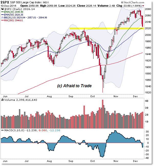
Look Out Below if this Simple Support Level fails for the SP500

The S&P 500 has retraced quickly to a known support target and we’ll focus on this current confluence level with great interest.
Let’s highlight this level and plan a pathway if buyers fail to intervene here as they’ve done in the past (on the weekly chart).

A simple plan would have us focus on the 2,020 highlighted confluence of the September price high with the rising 50 day EMA. (more)

Please share this article

Triple Lutz Report #373 – After Three Years Is Gold Getting Ready To Break Out

from Financial Survival Network
After over three years in the investment doghouse, it looks like gold might just be getting ready for a breakout. It quickly added on to yesterday’s gains and silver broke $17. We’ve seen this happen so many times that we’re all skeptics, but one of these days we’ll be skeptics no more and the great unwinding will resume its course. We’re pretty sure the wait will soon be over. Part of the reason is because of the work of Martin Armstrong. When it comes to forecasting he has few equals. But it’s also due to many of the cycle guys out there. Perhaps you can’t trust any one of them, but when they’re all flashing green, you’ve certainly got to wonder what’s next!
Click Here to Listen to the Audio
Please share this article

Wednesday, December 10, 2014

Heed the Red Flag Tesla Stock Is Waving: TSLA

In retrospect, a trader looking at the situation with an unbiased eye can’t be entirely surprised Tesla Motors Inc (TSLA) shares are tanking now.Although Tesla undoubtedly builds one of the coolest things we’ve seen this invented this century, “cool” and the ensuing hype can only carry Tesla stock higher for so long before the rally runs out of gas. That’s just the nature of a story stock like TSLA.
The question is, at what price might Tesla’s stock chart finally stop bleeding?
Answer: It has less to do with a rebound in oil prices than one might think.
Tesla Stock Chart Tells the Tale
All stocks ebb and flow over time, so in that regard the up and down we’ve seen from Tesla stock since 2013 isn’t particularly remarkable. On the flip side, not every stock chart often waves the same red flag that the Tesla stock chart started to wave as of last week, and is waving more fervently now.  (more)

Please share this article

Interest Rates Have Nowhere To Go But Up?

Earlier this week Daniel Druger and Liz McCormick wrote an article for Bloomberg entitled: "One Hundred Years Of Bond History Means Bears Destined To Lose." The crux of the article is contained within the following paragraph:
"With the longest-dated Treasuries now yielding less than half the 6.8 percent average over the past five decades, it’s not hard to see why forecasters say they’re bound to rise as the Federal Reserve prepares to raise interest rates following the most aggressive stimulus measures in its 100-year history."
The premise here is simple. With interest rates near their lowest levels on record, they have nowhere to go from here "but up." This is the consensus of virtually all of the analysts and economists on Wall Street which currently suggests that rates will rise to 3.88% next year on the 30-year treasury.  (more)

Please share this article