Saturday, April 30, 2011

Why anyone buying stocks today could be severely disappointed

Listen to this article. Powered by Odiogo.com

Stock market movements since the start of the credit crisis have been characterised by relatively high volatility as uncertainty became paramount. And as new pieces of the economic recovery puzzle are added every day, investors are increasingly struggling to make sense of the most likely direction of stock prices.

It seems to be a case of so many pundits, so many views. Has the market started topping out and is a primary bear market about to resume, or will the secular bull market merely be correcting the strong rally that commenced in March 2009, before moving higher? Or is a “muddle-through” trading range in store?

It is one thing to trade the market’s rallies and corrections, but this is easier said than done, with not many people actually getting it right with any degree of consistency. Others are of the opinion that the recipe for creating wealth is simply to follow the patient approach, saying that “it’s time in the market, not timing the market” that counts.

This gives rise to the all-important question: does one’s entry level into the market, i.e. the valuation of the market at the time of investing, make a significant difference to subsequent investment returns?

In an attempt to cast light on this issue, my colleagues at Plexus Asset Management have updated a previous multi-year comparison of the price-earnings (PE) ratios of the S&P 500 Index (as a measure of stock valuations) and the forward real returns, as done by Jeremy Grantham’s GMO. Our study covered the period from 1871 to April 2011 and used the S&P 500 (and its predecessors prior to 1957). In essence, PEs based on rolling average ten-year earnings were calculated and used together with ten-year forward real returns.

In the first analysis the PEs and the corresponding ten-year forward real returns were grouped in five quintiles (i.e. 20% intervals) (Diagram A.1).

The cheapest quintile had an average PE of 8.9 with an average ten-year forward real return of 11.0% per annum, whereas the most expensive quintile had an average PE of 25.5 with an average ten-year forward real return of only 2.1% per annum.

This analysis clearly shows the strong long-term relationship between real returns and the level of valuation at which the investment was made.

The study was then repeated with the PEs divided into smaller groups, i.e. deciles or 10% intervals (see diagrams A.2 and A.3).

This analysis strongly confirms the downward trend of the average ten-year forward real returns from the cheapest grouping (PEs of less than six) to the most expensive grouping (PEs of more than 21). The second study also shows that any investment at PEs of less than 12 always had positive ten-year real returns, while investments at PE ratios of 12 and higher experienced negative real returns at some stage.

A third observation from this analysis is that the ten-year forward real returns on investments made at PEs between 12 and 19 had the biggest spread between minimum and maximum returns and were therefore more volatile and less predictable.

As a further refinement, holding periods of one, three, five and 20 years were also analysed. The research results (not reported in this article) for the one-year period showed a poor relationship with expected returns, but the findings for all the other periods were consistent with the findings for the ten-year periods.

Although the above analysis represents an update to and extension of an earlier study by GMO, it was also considered appropriate to replicate the study using dividend yields rather than PEs as valuation yardstick. The results are reported in diagrams B.1, B.2 and B.3 and, as can be expected, are very similar to those based on PEs.

Based on the above research findings, with the S&P 500 Index’s current ten-year normalised PE of 27.1% and dividend yield of 1.8%, investors should be aware of the fact that the market is by historical standards in “extreme overvaluation” territory. As far as the market in general is concerned, this argues for unexciting long-term returns, and possibly a “muddle-through” trading range for quite a number of years to come.

Although the research results offer no guidance as to calling market tops and bottoms, they do indicate that it would not be consistent with the findings to bank on above-average returns based on the current valuation levels. As a matter of fact, there is a distinct possibility of below-average returns.

Valuing A Real Estate Investment Property

From a quantitative perspective, investing in real estate is somewhat like investing in stocks. In order to profit in real estate investments, investors must determine the value of the properties they buy and make educated guesses about how much profit these investments will generate, whether through property appreciation, rental income or a combination of both.

Equity valuation is typically conducted through two basic methodologies: absolute value and relative value. The same is true for property assessment. Discounting future net operating income (NOI) by the appropriate discount rate for real estate is similar to discounted cash flow (DCF) valuations for stock, while integrating the gross income multiplier model in real estate is comparable to relative value valuations with stocks. Here we'll take a look at how to valuate a real estate property using these methods.

Comparable Equity Valuations Absolute valuations models determine the present value of future incoming cash flows in order to obtain the intrinsic value of a share; the most common methods are dividend discount models and discounted cash flow techniques. On the other hand, relative value methods suggest that two comparable securities should be similarly priced according to their earnings. Ratios such as price-to-earnings and price-to-sales are compared to other intra-industry companies to determine whether a stock is under or over-valued. As in equity valuation, real estate valuation analysis should implement both procedures in order to determine a range of possible values.

Calculating a Real Estate Property's Net Operating Income

Where:

NOI - net operating income r- Required rate of return on real estate assets g- Growth rate of NOI R- Capitalization rate (r-g)

The net operating income reflects the earnings that the property will generate after factoring in operating expenses but before the deduction of taxes and interest payments. Prior to deducting expenses, the total revenue gained from the investment must be determined. Expected rental revenue can initially be forecasted based on comparable properties in the area. By doing the proper market research, an investor can determine what prices tenants are being charged in the area and assume that similar per-square-foot rents can be applied to this property. Forecasted increases in rents are accounted for in the growth rate within the formula.

Since high vacancy rates are a potential threat to real estate investment returns, either a sensitivity analysis or realistic conservative estimates should be used to determine the forgone income if the asset is not utilized at full capacity.

Operating expenses include those that are directly incurred through the day-to-day operations of the building such as property insurance, management fees, maintenance fees and utility costs. Note that depreciation is not included in the total expense calculation. The net operating income of a real estate property is similar to the EBITDA of a corporation.

Determining the appropriate discount rate is somewhat more complicated than calculating the WACC of a firm. Although there are different ways to obtain the capitalization rate, a common approach is the build-up method. Starting with the interest rate, add the appropriate liquidity premium, recapture premium and risk premium. The liquidity premium arises due to the illiquid nature of real estate, the recapture premium accounts for net land appreciation, while the risk premium reveals the overall risk exposure of the real estate market.

Discounting the net operating income from a real estate investment by the market capitalization rate is analogous to discounting a future dividend stream by the appropriate required rate of return, adjusted for dividend growth. Equity investors familiar with dividend growth models should immediately see the resemblance.

Finding a Property's Income-Generating Capacity

The gross income multiplier approach is a relative valuation method that is based on the underlying assumption that properties in the same area will be valued proportionally to the gross income that they help generate. As the name implies, gross income is the total income before the deduction of any operating expenses. However, vacancy rates must be forecasted in order to obtain an accurate gross income estimate.

For example, if a real estate investor purchases a 100,000 square foot building, based on comparable property data he may determine that the average gross monthly income per square foot in the neighborhood is $10. Although the investor may initially assume that the gross annual income is $12 million ($10*12 months*100,000 sq. feet), there are likely to be some vacant units in the building at any given time. Assuming that there is a 10% vacancy rate, the gross annual income would be $10.8 million ($12m *90%). A similar approach is applied to the net operating income approach as well.

The next step in assessing the value of the real estate property is to determine the gross income multiplier. This can be achieved if one has access to historical sales data. Looking at the sales price of comparable properties and dividing that value by the gross annual income that they generated will produce the average multiplier for the region.

This type of valuation approach is similar to using comparable transactions or multiples to value a stock. Many analysts will forecast the earnings of a company and multiply the EPS figure by the P/E ratio of the industry. Real estate valuation can be conducted through similar measures.

Roadblocks to Real Estate Valuation Both of these real estate valuation methods seem relatively simple. However, in practice, determining the value of an income-generating property using these calculations is fairly complicated. First of all, obtaining the required information regarding all of the formula inputs such as net operating income, the premiums included in the capitalization rate and comparable sales data may prove to be extremely time consuming and challenging. Secondly, these valuation models do not properly factor in possible major changes in the real estate market such as a credit crisis or real estate boom. As a result, further analysis must be conducted to forecast and factor in the possible impact of changing economic variables.

Because the property markets are less liquid than the stock market, sometimes it is difficult to obtain the necessary information to make a fully informed investment decision. That said, due to the large capital investment typically required to purchase a large development, this complicated analysis can produce a large payoff if it leads to the discovery of an undervalued property (similar to equity investing). Thus, taking the time to research the required inputs is well worth the time and energy.

The Bottom Line Real estate valuation is often based on similar strategies to equity analysis. Other methods, in addition to the discounted net operating income and gross income multiplier approach, are also frequently used. Some industry experts, for example, have an active working knowledge of city migration and development patterns. As a result, they are able to determine which local areas are most likely to experience the fastest rate of appreciation. Whichever approach one decides to use, the most important indicator of its success is how well it is researched.

Friday, April 29, 2011

How to “Play” a Parabolic Move in Silver

Why Silver is Not in a Bubble Yet

In order to successfully identify bubbles and profit from them, one needs to know the tipping point at which a bubble [in this case a silver bubble] is unsustainable and begins to breakdown…This article focuses on just one of a myriad of factors that determine when a bubble may pop – momentum – and addresses what trading strategies may be suited to the situation. [Let me go on.] Words: 1475

So says www.skoptionstrading.com in an article* which Lorimer Wilson, editor of www.munKNEE.com, has further edited ([ ]), abridged (…) and reformatted below for the sake of clarity and brevity to ensure a fast and easy read. Please note that this paragraph must be included in any article re-posting to avoid copyright infringement. The article goes on to say:

A casual glance at the chart below could leave an impression that history is going to repeat itself andsilver prices are about to crash.

Silver Price Since 1968

The Momentum Factor

In finance, momentum is the empirically observed tendency for rising asset prices to continue to rise. We are attempting to gauge when silver may run out of momentum and when this bull market will turn into a bubble and ultimately pop. Whilst some may consider it crude to study momentum as opposed to fundamentals such as supply and demand, we feel that it is vitally important from both a psychological and technical standpoint.
  • Psychologically: If investors are used to silver prices increasing 30% per year and then silver prices only increase at a rate of, say, 15% for one year, psychologically this return looks poor on a relative basis, even though it is still positive and normally would leave many investors satisfied. Therefore, there is a greater incentive to sell silver since it is not performing as well as it was in the past.
  • Technically: Once a bubble is fully underway prices begin to rise in a parabolic or exponential fashion. If the price ceases to rise in an exponential fashion, selling will commence, even if the price is still rising, since investors will have extrapolated the exponential rise and so anything short of parabolic will not meet their expectations.

The most recent example of momentum was in the housing bubble. Prices didn’t actually have to fall at all to trigger a crash, all they had to do was plateau or rise sluggishly and this would spark selling by people who had bet on prices continuing to rise. Without continually rising prices real estate investors could not refinance and borrow more against their properties to buy additional properties or other assets, so the buying stopped and the selling began. This was when the bubble popped; this was the tipping point before the actual crash that many investors strive to identify.

Sign up for your FREE weekly “Top 100 Stock Index, Asset Ratio & Economic Indicators in Review”

How does the above relate to silver? Although we believe that silver does indeed have strong fundamentals, we do think it is likely that the metal will become drastically overvalued in the future as a result of speculative buying by the masses. In an attempt to measure the momentum behind silver and when this momentum will run out, we have analyzed the rate of silver prices increases over the last 50 years or so, since 1968. The chart below shows the rolling 100 day percentage change in the silver price. This is not a perfect measure of momentum, but it’s a start.

100 day pct change in silver prices since 1968

Why Silver is Not in a Bubble

As you can see, during the blow off in 1980, silver prices were increasing at a rate of roughly 400% per 100 trading days. This compares with a current rate of increase of approximately 73% per 100 trading days. So if you think silver’s current rally is going at a nose bleed pace, in the 1980 blow off silver prices were increasing 5.47 times faster than they are at the moment.

So far it appears that the rate of increase in silver prices at present is still below the relative rate of increase in 1980, therefore implying there is further upside. However this analysis doesn’t take into account that the Bunker-Hunt brothers were attempting to corner the market for physical silver in the late 70s, a buying force which is not present today. Therefore one should err on the side of caution when using this barometer for trading purposes as it may not reach 1980 levels. At present the barometer isn’t even close, so we do not think silver is in bubble at the moment.

The chart below best shows how silver is far from in a bubble yet. We have smoothed the 100 day percentage change and overlaid the nominal silver price.

silver prices and rate of increase since 1968

As shown by the blue line still being relatively low in contrast with 1980, there is still a great deal of upside potential for not only the silver price itself, but the rate at which silver prices are increasing. When both the blue and red lines are parabolic, then a bubble argument can be made.

Some Suggestions on How to Invest in a Silver Bubble

As always the most important part of any discussion of the financial markets is how one should deploy one’s capital. Whilst a silver bubble is not yet upon us [one should consider one of the following approaches if, and when, such were to occur]:

  • Take a short position: In our opinion this is not a particularly attractive trade. Whilst, of course, the investor will make money if silver prices fall, the investor is also open to unlimited liability on the upside and should silver prices continue to rise substantial losses could be incurred. Taking an outright short position via futures or short selling silver stocks implies that one believes that one’s timing is spot on. In reality nobody can ever have perfect timing so it makes sense to allow for some error in your judgement when placing the trade. This is important when placing any trade, but it is particularly crucial where bubbles are concerned since the market is moving in extreme ways. In the 1980 blow-off silver was increasing at a rate of over 100% per 30 days, anyone who was short would have got wiped out, just for being 30 days too early.
  • Utilize options: Taking a position that would benefit from an imploding silver bubble offers much better risk-reward dynamics than being outright short.

There are two basic trades that we think would be attractive under an options scenario:

  1. Allocate small amounts of capital to near term ‘out of the money’ puts: By purchasing puts that are, say, three months or less from expiration and at least 25% out of the money the investor is effectively buying insurance against a crash in silver prices. If silver prices plummet then the value of the puts will explode, but if prices keep soaring the downside is strictly limited to the premium paid for the put. If this trade is placed prematurely, it can be placed again in another few months, and again and again so long as the trader holds the view that silver prices are going to crash. If the view is correct then the eventual payoff will more than cover the cost of being too early in buying the initial puts.
  2. Sell at the money call vertical spreads which are more than a year from expiration: This is a trade that expresses the view that prices are not sustainable in the longer term and therefore by the time the call options expire they will likely be worthless due the fall in silver prices. Additionally, if prices were spiking higher it is likely that call options would be being bought heavily by speculators, thereby inflating their premiums. By selling these call spreads one would benefit from a fall in silver prices and a reduction in call buying/increase in call selling by speculators over a longer term time period, without taking on unlimited risk.

We do not think either of the above trades are attractive at present. We are merely pointing out that they may be in the future if a bubble scenario does unfold.

Conclusion

During the blow off in 1980 silver was increasing at a rate of roughly 400% per 100 trading days compared with a current rate of increase of approximately 73% per 100 trading days, i.e. 5.47 times faster than presently. [Therefore,] even if silver were to rise only half as fast as that of 1980, it could still rise twice as fast as it currently is before blowing off – so silver is far from in a bubble at the present time. [That being the case] we think it is the best, for now, to let silver run.

Gerald Celente on Ben Bernanke and the Fed from RT - 27 Apr 2011

Weiss Ratings Initiates US Debt Just Above ‘Junk’

Weiss Ratings, an arm of Jupiter, Fla., research firm Weiss Research, has initiated coverage of sovereign nation debt by ranking U.S. debt at “C,” a level it calls “two notches above junk” status.

Weiss Ratings puts U.S. debt at 33rd of 47 nations it rates, below China and other Asian exporters but above debt-plagued European nations such as Ireland, Greece and Portugal.

“If you own medium- or long-term government notes and bonds, dump them immediately,” said Martin Weiss, chairman of The Weiss Group, in a release.

“If you have your cash in short-term U.S. Treasury bills, be sure to surround them with investments that go up when the U.S. dollar falls,” he said. “And if you wish to profit from this crisis, consider adding still further to those contra-dollar investments.”

dollar200getty2.jpg
The dollar continues to fall.
(Getty Photo)
Weiss said that the ratings decision was made to protect investors from triple-A ratings given to U.S. debt by the three largest ratings agencies — Standard & Poor's, Moody's, and Fitch Ratings — which he called “fundamentally unfair” to investors.

“It fails to warn you of real dangers. And it helps keep your yield far too low to compensate for the risks you're taking. Investors urgently need a more honest rating,” Weiss said.

The false security of such high ratings means that politicians are likely to feel that they can continue to debate U.S. spending at a time when action is necessary, Weiss said. “If they had only issued a fair rating years ago, it could have played a pivotal role in helping lawmakers and policymakers take earlier remedial steps,” he said.

He went on to predict, absent of a serious spending reforms, a “further deterioration in the nation's finances” likely to trigger “a series of events beyond their control,” including:

• The dollar losing its status as a reserve currency.

• Global investors, already dumping the U.S. dollar, dumping U.S. bonds in a panic.

• Investors demanding draconian cutbacks in U.S. government spending.

• In turn, a vicious cycle of economic declines, larger deficits, and further investor demands for even greater cutbacks.

In the Weiss ratings scale, ranging from “A” (excellent) to “E” (very weak), only sovereign countries with stellar scores in four major areas — debt burdens, international stability, economic health and market acceptance — merit a grade of “A-minus” or better.

Meanwhile, on the low end of the scale, only countries that demonstrate severe or consistent weaknesses in the four areas receive a grade of “D-plus” or lower, according to Weiss Ratings.

Unemployment Claims Jump 25,000

The Unemployment Insurance Weekly Claims Report was released this morning for last week. Claims rose 25,000 from an upward revision of the previous week to 429,000. The 4-week moving average increased by 2.3%. Here is the official statement from the Department of Labor:

In the week ending April 23, the advance figure for seasonally adjusted initial claims was 429,000, an increase of 25,000 from the previous week's revised figure of 404,000. The 4-week moving average was 408,500, an increase of 9,250 from the previous week's revised average of 399,250.

The advance seasonally adjusted insured unemployment rate was 2.9 percent for the week ending April 16, a decrease of 0.1 percentage point from the prior week's revised rate of 3.0 percent.

The advance number for seasonally adjusted insured unemployment during the week ending April 16 was 3,641,000, a decrease of 68,000 from the preceding week's revised level of 3,709,000. The 4-week moving average was 3,697,750, a decrease of 22,750 from the preceding week's revised average of 3,720,500.

Today's number was 10% above the Briefing.com consensus estimate of 390,000 claims.

As we can see, there's a good bit of volatility in this indicator, which is why the 4-week moving average (shown in the callouts) is a more useful number than the weekly data.

Occasionally I see articles critical of seasonal adjustment, especially when the non-adjusted number better suits the author's bias. But a comparison of these two charts clearly shows extreme volatility of the non-adjusted data, and the 4-week MA gives an indication of the recurring pattern of seasonal change in the second chart (note, for example, those regular January spikes).

Because of the extreme volatility of the non-adjusted weekly data, a 52-week moving average gives a better sense of the long-term trends.

The Bureau of Labor Statistics provides an overview on seasonal adjustment here (scroll down about half way down). For more specific insight into the adjustment method, check out the BLSSeasonal Adjustment Files and Documentation.

For a broader view of unemployment, see the latest update in my monthly seriesUnemployment and the Market Since 1948.

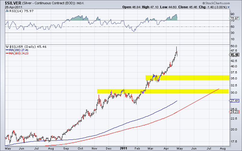
Downside Targets for Silver

Silver is in a structural bull market and will see significantly higher prices in the coming years. However, now is not the time to be buying. The market has spiked and a retracement is coming. Sentimentrader.com’s public opinion as of last week was over 90% bulls. The daily sentiment index as of last week was 96% bulls. A correction is coming. We have two charts to help decipher a potential bottom. Here is our first chart: On top we plot Silver’s distance from its 200-day MA. Note that following previous spikes, the market always tested its 200-day MA and it didn’t take long for it to happen. We also compare the current spike to the spikes in 2004 and 2006. Those spikes retraced a little bit more than 62%. The 62% retracement of this spike is nearly $30. Here is the second chart: We see two areas of strong support. The first is $34-$37 and the second is $30-$31. We also sketch the potential path of the 300-day MA. We think it hits $30 in July. The 200-day MA is likely to hit $32 before the end of July. Last year we noted $32-$33 as a potential strong upside target based on the price action in 1980-1981 and various Fibonacci targets. The 38% retracement of the 2008 low to this top is roughly $34. To conclude, our support points range from $30 to $37 with the strongest confluence at $33-$34. Throughout 2010 we wrote about the key resistance in Silver at $20-$25. We noted that the breakout would be very big and eventually take Silver to $50. We didn’t expect it to happen immediately. Gold reached its now former all time high in 2008. Three years later, Gold is nearly 80% higher (than $850). The point is, a market that makes a new all time high for the first time in decades is a market that moves even faster in the future. If Silver follows the same path as Gold then we could be looking at $90 Silver in 2014. Yet, wouldn’t you rather increase your positions in the $30s rather than at $45 or $50?