Friday, March 25, 2011

Use the VIX to Spot Opportunities: IVO, SPY, TVIX, TVIZ, VIIX, VIIZ, VIXM, VIXY, VXX, VXZ, VZZ, XIV, XVIX, XXV, ZIV

I did some research on the VIX about fifteen years ago that I subsequently filed away for a later date. This may be good time to bring it forward and get some discussion on it.

The research presents a very simple and quick way to determine when options players are acting “rationally” or “irrationally” about the market; that is, if the VIX implied market volatility actually matches real market volatility (rational), or if the VIX is over- or under-stating it (irrational). It’s based on the idea that the VIX doesn’t really tell you anything by itself. It’s only when you compare it with the market’s actual volatility that it really does say something unique.

What is the VIX?

One major problem with the VIX is that few investors know what it really is. In fact it’s even been given a wrong name. It’s called the fear index although it’s anything but. The entire subject of the VIX and even options themselves starts with something called the Black Scholes equation for options pricing; a thing considered so important it actually won the economist Myron Scholes a Nobel Prize in 1997.

In this equation you insert the option’s strike price, the current stock price, as well as the time remaining before option expires. You also insert a riskless interest rate but don’t ask why; it’s not as critical as these other factors by a wide margin. Lastly, you insert the stock’s volatility number. Like magic, the equation spits out the theoretical price you should pay for that option. What anyone did before this equation is anyone’s guess.

The Volatility Calculation

Of all these inputs the only confusing one is probably the volatility number. How is a stock’s volatility calculated? Essentially you go back five or ten years and do these day-to-day calculations on price and from these you get a number that represents the yearly price variation of that stock. This procedure works fine if the option in question is long term, say six to nine months from expiration. There, any sudden short term change in volatility from a news item dampens out over time. When pricing a long term option you use this stable number; you don’t use any short term volatility number; it won't work well.

However, when pricing a shorter-term option, say one expiring in a month, this long term number doesn’t work well. You must use a shorter term calculation of volatility. You might use a ten or fifteen day volatility calculation. While this calculation will vary widely it will more accurately reflect the market conditions that will apply to that option over its shorter lifetime.

The VIX is 'Implied' Volatility

Now here is where some market technician got ingenious. Someone thought, “Instead of doing this short-term calculation all the time, let’s calculate backwards. From the latest option price let’s figure out the volatility number traders are assuming at that moment.” This backward calculation is the VIX and it's why it’s called “implied” volatility; it’s the volatility number that’s “implied” by the Black Scholes equation using the most recent short-term option prices of the S&P 500 (SPY). The VIX for the last eleven years is shown in this first well-known chart below.
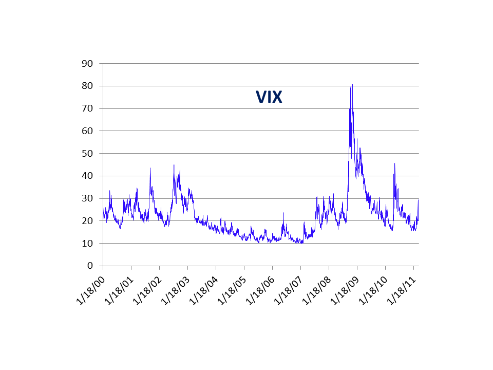
(Click chart to enlarge)

Implied Volatility vs. Real Volatility (almost)

Much has been written and spoken about the VIX, but in my opinion the VIX doesn’t indicate or say anything in itself. Maybe the VIX is simply measuring the real changing short-term volatility of the market and not telling us anything we don’t already know. To see if it is, we could calculate the market’s actual short-term volatility and compare it with the VIX’s implied volatility. However, in doing this I’ve personally found it more useful to do another calculation of volatility over the standard formula. It's also simpler to do. It’s based on the fact that traders are much more alarmed by large day-to-day fluctuations in the market than the actual volatility number that theory might produce.

A Simple Modified Volatility Number

If the market goes up and down 3% a day, but over time doesn’t go anywhere, that will show as a low volatility calculation. Yet we know that investors will not (rightfully) consider it so. Just like a person jumping and going up and down ten feet in the air, they may not get anywhere but they will still cause a lot of commotion. Because of this a more accurate idea, in my opinion, is to simply calculate the average absolute value of the daily percentage change in the market over a short time period. The second chart shows this; it plots the VIX index (blue) against a simple 10-day moving average of the absolute daily price change in the S&P 500 (red). The two numbers are normalized (put on the same scale) by using a simple conversion factor that does this.
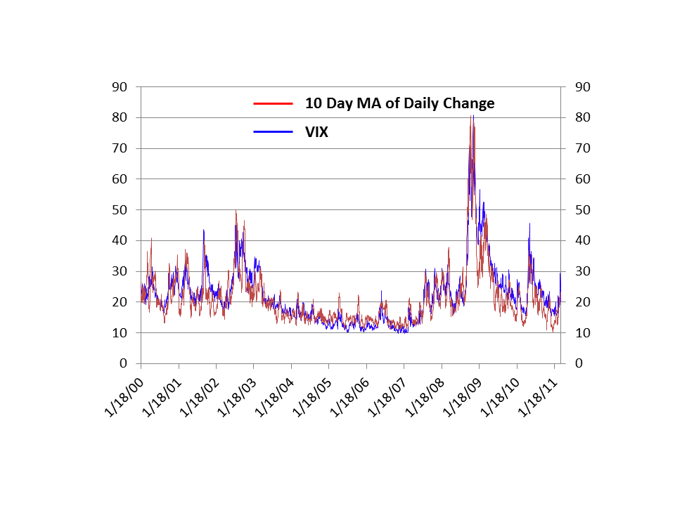
The most obvious message from this comparison is that the VIX, at least on a macro scale, simply reflects what is happening short-term in the market itself. In effect it doesn’t tell you anything new that could not be calculated using old standard market volatility measurements of the market itself. You don’t even need options. But as usual the truth is in the details.

The Details

Experience with market psychology or investor sentiment over many years shows what is usually important when expectations get either too one-sided or when they don’t match what is really happening. For example, if the market rallies and investor are doubtful that is usually a good sign; the market is rising against a wall of worry. In a similar vein with the VIX, what should be important is not when the VIX matches real market volatility but when the VIX diverges from what is really happening volatility-wise. It’s when the market calms down, yet investors remain doubtful and jumpy. Or when real volatility rises, but options players ignore it and remain complacent.

Because of this what should be important is not the similarity in the two numbers but when they become widely different. The third chart shows this difference - the difference between the VIX and a smoothed version of the 10-day moving average of the daily absolute changes in the market. High numbers are when the VIX is overstating volatility (probably a bullish indicator) and low numbers the opposite.
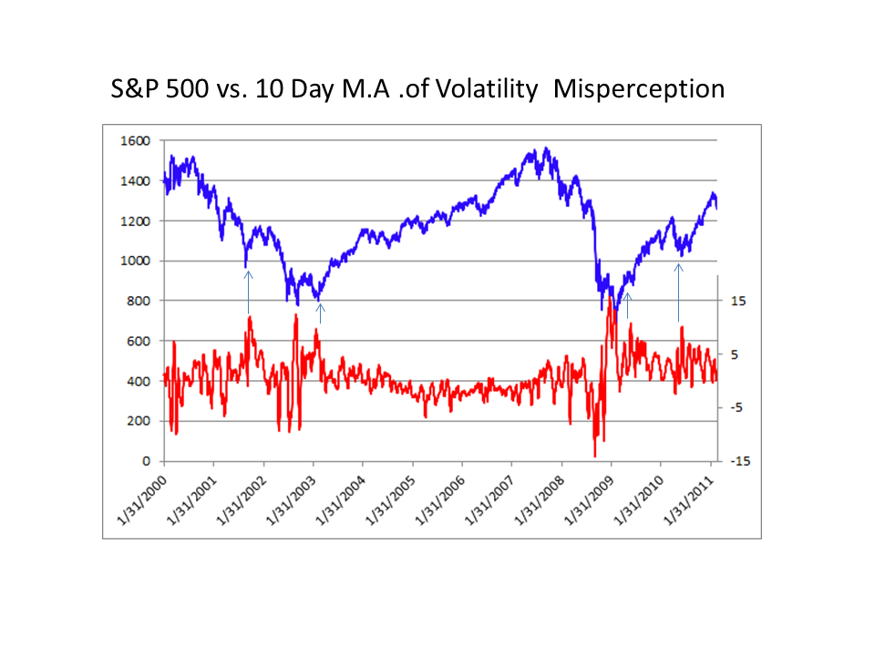
It is clear that high overstatement of volatility by the VIX corresponds to major buying opportunities as you would expect from basic theory. There were six periods in the last eleven years; four are shown by a blue arrow, the other two are obvious and are the two times the blue line met or almost met the red line.

There is one point this comparison made very clear last week. The recent surge in the VIX last week in response to the market decline and the Japanese catastrophe was a rational investor response. The increase in the VIX implied volatility pretty much matched the actual increase in market volatility.

Disclosure: I have no positions in any stocks mentioned, and no plans to initiate any positions within the next 72 hours.

A Fresh Look At Auto Part Stocks

We took a look at the auto part stocks back in February and noted how they were stalling out and could be either faltering or beginning to correct. While this group was in fact tired, it has held up quite well as it transitioned to more of a sideways correction. Many traders associate the word correction with lower prices, but there are times where a stock will correct through time as it works off excess bullishness. The auto part stocks have fallen somewhere in between with a pullback from recent highs, but also pretty solid respect of support levels underneath.

Tutorial: Technical Analysis

Advance Auto Parts (NYSE:AAP), for example, backed off from new highs late in 2010 and suffered a sharp decline toward the $60 level. It started to stabilize in this area before pulling back again in late February. However, the $60 level brought back buyers and is now forming the bottom of a larger base. AAP has now started to trade back above its 20- and 50-day moving averages as it hovers in the middle of its base. While AAP may not quite be ready to break out, the overall picture is starting to become more positive.

Source: StockCharts.com

AutoZone (NYSE:AZO ) is another stock that appears to have managed staving off a deeper correction. AZO also took a big blow after hitting new highs late in 2010. It failed miserably, dropping toward the $250 level in January and hovering at support for weeks. After a brief shakeout later in the month, AZO stabilized and attempted to move back higher. It didn’t last long as AZO pulled back toward the $250 level. This time buyers rushed in and pushed AZO back higher. AZO is now pretty close to the late 2010 highs and could be close to a breakout. (For further reading, check out AutoZone Not Sputtering.)

Source: StockCharts.com

Following the same pattern, Stoneridge (NYSE:SRI ) has been trading sideways for months as it corrects the rally that occurred through the second half of 2010. Things were looking tenuous in early February as SRI dropped under its 50-day moving average and hit new lows, but buyers defended the $14.25 area. Buyers continued to defend this area and SRI is now testing the top of the ascending triangle that has formed throughout the consolidation. A close above $16 could signal an end to the current consolidation.

Source: StockCharts.com

Tenneco Common Stock (NYSE:TEN ) also looked tenuous at best in early February as it entered a freefall on high volume. However, it rebounded just as sharply and reclaimed its 50-day moving average a few sessions later. From there it has continued to meander sideways as it narrows in range. TEN is currently at the apex of the triangle pattern it has been forming and should be close to a move in one direction or another.

Source: StockCharts.com

The Bottom Line
While things looked bleak a couple of months ago, time does heal wounds in the stock market. The auto part stocks have taken a much needed break as they consolidate some of the outsized gains from the last two years. The group is not out of the woods yet, but many stocks have now revealed clear support levels for traders to monitor. If these stocks can emerge from the bases they have been building, they could provide a great opportunity for patient traders.

At the time of writing, Joey Fundora did not own shares in any of the companies mentioned in this article.

By Joey Fundora

Oil Sands: Fueling the Future

For many years, trying to tap an oil sands deposit accomplished about as much as sipping molasses through a straw, but that is changing. So do oil sands companies make a good investment now?

Humans and bacteria share a surprising number of features, not least in what they consider good food. In general, the smaller and simpler the molecule, the easier it is to digest. So, about 50 million years ago, when and where bacteria had a chance to chow down on some of the rich hydrocarbons we call oil, one might expect them to start on the smaller, tidier mouthfuls, and indeed they did.

What’s left today of these bacterial banquets are deposits of oil molecules so big and cumbersome that they flow like molasses in winter, if at all. At the extreme end is bitumen, which looks rather like sticky asphalt:

The oil sands that contain this heavy oil and bitumen have long posed an intriguing “what-if” for the industry. heir potential is staggering. One of the world’s largest deposits, in the Canadian province of Alberta, spreads over the size of Wisconsin and may hold two trillion barrels of oil – eight times the reserves of Saudi Arabia.

For just about as long, however, oil sands have been minor players at best in the world’s energy picture. The very qualities that native peoples have exploited to seal their boats make these heavy oils and bitumen tough to suck out of the ground and shove down a pipeline. And that’s before they even get to a refinery.

Two developments in recent years have brought oil sands in from the cold: rising oil prices and new technology to pry bitumen out of deposits and make it run, not walk, to the nearest processing facility.

So let’s take a look at how oil sands came about and what we can do with them.

The Tale of Two Oil Deposits

We’re back to millions of years ago, this time to the hundreds of millions, when algae and the simple organisms that fed on them died, drifted down to the seafloor, and were gradually buried under sediments and subsequent generations of ancient life.

As the ages passed, the pressure of layers above and heat from inside the earth broke down and reassembled these simple plants and animals into chains of carbon atoms bristling with hydrogen. Under pressure, these hydrocarbons squeezed through grainy, porous sedimentary rock until blocked by nonporous rock, known as capstone. There accumulated the first of our tale, a deposit of what we now call conventional oil.

The other deposit was in for a second ride. Geological forces lifted these oil-bearing rocks up toward the surface of the earth, within reach of water and bacteria. You know what happened next.

Because of this additional history, oil sands differ in structure as well as content from conventional oil deposits. The bitumen coats the grains of sand like a film and is in turn surrounded by water. Scraping the bitumen off the grains is the first step in extraction.

The uplifting also means that oil sands deposits are relatively shallow: some can even be surface-mined like coal.

This geological process happened in places like Venezuela and the United States, and particularly in Canada. In the province of Alberta are three major oil sands areas: the Athabasca (the largest), Peace River, and Cold Lake. Current estimates put the combined bitumen in these deposits at 1.7 trillion barrels, and some geologists believe more field work will jack that number up a fair bit further.

The catch is that, at present, only 10% or 170 billion barrels of that bitumen is considered economically recoverable, that is, worth a producer’s considerable effort to bring it to market. Even so, 170 billion barrels places Alberta second only to Saudi Arabia in terms of proven oil reserves, and ever-developing technology is likely to bring more in reach.

We’re going to focus on Alberta because it’s home to the largest and most developed oil sands deposits in the world.

To Market, to Market: Step 1

Surface mining operations dig up and crush the oil-soaked rock, then mix it with water heated to 50-80°C. In such conditions, the bitumen floats off. All told, bitumen recovery from strip mines approaches 90%, and the mining and processing costs come in at about US$8.00 per barrel.

However, only about 20% of Alberta’s bitumen is shallow enough for surface mining. The remaining 80% requires drilling and in-situ methods that extract the oil from the rocks in place. There are several methods to do this, and more in development. What they generally have in common is pumping down steam to heat the trapped oil, making it less viscous. Then a producer can actually pump the bitumen to the surface.

Many oil sands companies use this in-situ method, called steam-assisted gravity drainage (SAGD).

Another factor in-situ methods have in common is the large amounts of energy required to generate the steam. At present that energy usually comes from natural gas, which comprises 65-80% of total operating costs.

According to government statistics, Alberta is host to 91 producing oil sands projects as of 2009. Of these, only four are mining projects, while the remaining 87 use various in-situ recovery methods. In 2009 those projects produced an average of 1.49 million barrels of bitumen per day (bbpd), which represents more than 40% of Canada’s total oil production. That 1.49-million figure is projected to reach 3 million bbpd by 2018.

To Market, to Market: Step 2

However it’s recovered, this stiff black glop needs further work in order to sell it. An oil sands producer has two choices: to upgrade it and make synthetic oil, or to dilute it with lighter hydrocarbons so it can run down a pipeline to a refinery.

Upgrading usually requires two steps. First the bulky hydrocarbon chains are broken into smaller ones in a process called hydrocracking; upgraders may also remove carbon to produce the smaller chains along with coke. The second step adds hydrogen to “fill out” the new carbon chains and to remove impurities like sulfur. Currently five upgraders in Alberta churn out a bit over 1 million barrels of synthetic crude oil each day, and there are plans for more.

Bitumen that’s not upgraded is blended with diluents that make it runny enough to pipe to refineries throughout North America. The diluents are usually a mixture of light hydrocarbons, such as light crude oil and naphtha. Companies can recycle diluents that stay within Alberta, a significant consideration in project planning.

The investment to get the industry to this stage has been massive. Between 1999 and 2009, an estimated $91 billion was pumped into developing Alberta’s oil sands. In 2009 industry invested another $10 billion, and almost $170 billion worth of oil sands projects are currently underway or proposed in the province.

Environmental Issues

Environmental groups have labeled bitumen “dirty oil” and are calling for an end to oil sands operations. They have three main complaints: that ugly mines and tailings ponds destroy habitat, that projects gulp energy and emit significant emissions for every barrel of oil, and that the whole process uses a significant amount of water.

The groups are certainly right on some fronts. In-situ operations cause minimal disturbance, but surface mining – even though it represents only 20% of oil sands operations – does make an unsightly mess of boreal forests and marshlands. And in-situ projects have their own issues. The roughly 30 cubic meters of natural gas and three barrels of water consumed to produce one barrel of bitumen are indeed high.

Well, oil sands aren’t going away. Their potential is too vast, global demands for energy too high, and for governments like Alberta, they contribute too much to the coffers.

But more encouraging yet, industry is developing less intensive techniques. Quick-drying tailings ponds can be returned to nature faster, for example. And companies have a double incentive to develop in-situ methods that require less energy and water: they would lower operating costs as well as mitigate complaints.

9 Stocks George Soros Is Buying : C, DAL, F, GM, MSI, MT, PBR, UAL, WMT

Investment Underground took a look at a few promising picks that George Soros' funds are buying. Here are our noteworthy favorites to keep an eye on that may impact your portfolio:

General Motors (GM): When coming from such lows, mega highs are needed to get back up. EPS estimates for this year are thus, understandably hyperbolic: 574%! (For some leveled perspective, GM is looking at a much more reasonable five-year EPS projection of 24%.) We’ll see this week if we’re on track. The leader of the U.S. car market, with 19% of it in its pocket, GM has fought a very rocky battle over the past few years. With new leadership that has an eye on a clean debt book, a condensed and somewhat diversified product portfolio and healthy North American operations it looks like GM, dependent on consumer behavior of course, might be able to take off its boxing gloves for a bit, or at least get itself out of the corner and land some punches of its own.

Petroleo Brasileiro (PBR): This massive Brazilian producer has been boosted recently by the major discovery of reserves off the Brazilian coast. This type of extraction is more costly than traditional extraction, so, as prices for oil rise, the justification and margin son this type of extraction grows. Libyan instability leads to spike in oil prices which leads to increased value of PetroBras’s reserves. That said, this type of extraction is also known for its long-term nature. That means that investors are aware that the benefits of the reserves will be elongated over a period of time so momentary shakes to the oil market can have less of an effect on the stock. This is a double-edged sword.

United Continental (UAL): United overpaid for Continental Airlines, and the company will face a tough job continuing to integrate the airline over the next few years. Competitors, both established and new, as well as significant fuel price increases will hamper this company. UAL can grow revenues with higher ticket prices and we expect mid margin expansion due to synergies developing, albeit at half the $1 billion figure offered by management. We value shares at $23 apiece using a 12% discount rate. Events in Japan are not helping the company, though operators like Delta (DAL) are bearing the brunt of reduced air traffic to and from the island.

Motorola, Inc (MSI): In January the mobile telecommunications and technology giant had broken up into Motorola Solutions and Motorola Mobility. IU’s information is dedicated to Motorola Solutions (MSI), a company with 51,000 employees. Its market cap stands at 14.02B with a return on assets at 2.54%. The revenue is 19.28B. Its trailing annual dividend yield is 3.78. We recently highlighted that Dodge & Cox funds have a significant ownership stake in the company.

ArcelorMittal (MT): has a market cap of $53 billion. It trades under a P/E of 20.66, and with a PEG of 0.80, but with a dividend yield of 1.8%. In 2010, MT made $78 billion in revenues, which is an increase of 19.84%. Net income is up to $2.9 billion. This is a jump of 2371%. EPS also went from $0.08 to $1.72. The ROE is 4.72% and ROA is 2.26%.

The EBIT and profit margins are 2.38% and 8.9%, respectively. The current ratio is 1.39 with a D/E of 0.31. 52 week trading range is $26.28 - $47.25. The 30 day put/call ratio is 0.8.

Walmart (WMT): While present in Japan, it is far from its most crucial market and in the words of a Moody’s analyst, it won’t a have material impact on the company’s operations. Currently trading at $51.52/share, it hasn’t deviated by more than 2% from this price in the past 20 days. Its forward P/E of 10.6 lends itself to the view that it should climb higher to reach fair value in the $60/share range.

Citigroup (C) has shown four straight quarters of profit, after being squarely embroiled in the financial meltdown of 2008. In sum, the company made $10.6 billion in profits in 2010. The company also grew revenues by 7.87% in 2010, and 52.08% in 2009. The EBT margin in 2010 improved to 15.22%. In its heyday, Citigroup traded with P/S multiples in the 3’s. Now, it is 1.5, and the industry average is 1.3. EPS came in at $0.35 in 2010, recovering from -$0.80 in 2009. Analysts expect 2011 to produce an EPS between $0.32 and $0.55. Shares trade under $5. This is a long-term play.

Delta Airlines (DAL): Delta should be able to grow revenues at a 7% clip and keep margins around 6%. Fuel prices will hamper any real growth for the company, however. Periodic battles for market share with other established and newer players in the industry will keep a lid on Delta. We value shares at $10 apiece using a 12% discount rate. Delta recently announced that its revenue losses due to the crisis in Japan would amount to $400 million, a significant chunk for the company.

Ford (F): Ford is trading at a very low $14-15 per share, well below fair value of $23 per share, on a discounted cash flow basis. EPS for 2011 are forecast at 113% with a five-year projection of nearly 13%. Broad trends suggest that it is stealthily improving its position in the competitive landscape: a consolidation of brands, a gain in market share over the past year and the shedding of debt. On this last point, it was just announced that Ford will redeem, in cash, all 6.50% convertible trust preferred securities, effectively taking off $3 billion in debt from its books and reducing total debt to $16 billion. As earnings announcements loom, these dual events could act as a catalyst to bring its stock price nearer to fair value. We use an 11% discount rate for the company.

Disclosure: I have no positions in any stocks mentioned, and no plans to initiate any positions within the next 72 hours.

The Dollar Will Collapse Within 3-4 Months

The US Dollar's inflationary death spiral continues. We've now taken out the 2010 low leaving only two more lines of support before we're in completely uncharted territory.


At its current rate of collapse, the US Dollar will do this within the next 3-4 months. This means the greenback will break into a new all-time lows by 2H11, which will precipitate the coming inflationary collapse.


Small wonder then that both Gold and Silver recently hit new highs for their current bull markets. With the greenback dropping like a rock, and rumors of QE 3 swirling around the financial community, what sane investor would bet against inflation?

On that note, now is the time to be shifting capital into inflation hedges. Those who buy Gold and Silver will likely do very well in the coming months (my personal view is Gold will clear $1,500 and Silver $40 this year).

We’re also going to be seeing an increased wave of buyouts in the natural resources sector as larger firms look to increase their resources via mergers and acquisitions rather than spending the money to find and develop new mines.

The natural resources sector will also benefit as large institutions (pensions, mutual funds, etc) finally begin piling into inflation hedges across the board. Given how little exposure the Big Boys have to inflation hedges even a small percentage of assets under management, shifted into these sectors, could result in sharp price spikes.

In other words, buckle up, cause things are about to get REALLY interesting.

BNN: Top Picks


Paul Harris, Partner & Portfolio Manager, Avenue Investment Management, shares his top picks.


click here for video

How to Get a 9%-Plus Yield on the Dow Large-cap stocks are the safest place to be right now

I always love to find a strong-paying income investment that just so happens to be right where the upside action is. It’s no secret that large caps have been the go-to stocks for the first three months of 2011, at least from the vantage point of professional fund managers. The lower U.S. dollar does wonders for companies with more than 50% of their business done outside the United States, and I don’t see this theme changing anytime soon.

Large-cap stocks are the safest place to be at a time when the dollar is weak, corporate profits are booming and, yet, we have soaring domestic budget deficits and geopolitical issues in the Middle East.

For those looking for income investments, one way to capture a fat 9%-plus dividend yield and own the biggest U.S. multinationals is to own the Dow 30 Enhanced Premium & Income Fund (NYSE: DPO). It’s a closed-end fund that invests in all 30 of the stock components of the Dow Jones Industrial Average while applying aggressive swaps and covered call options strategy.

The Dow has easily been the most resilient of the major averages when the dark clouds of uncertainty lift, and I think you would be well-served to have a portion of your assets in the index — while simultaneously collecting some hefty dividend income and option premiums.

The chart of DPO below shows a very constructive breakout from a “golden cross” in October. This occurs when the 20-day (green) and 50-day (yellow) moving averages move up through the 200-day (black) moving average, signaling a new uptrend. Currently, the market is in a period of consolidation, thanks to the front page of the daily newspaper showing havoc in the global oil patch.

DPO Stock Chart

This close-end fund will purchase other securities or financial instruments, primarily swap contracts, designed to provide additional investment leverage to the return of the Dow stocks.

Managers of the DPO fund also will engage in certain option strategies, primarily consisting of writing (selling) covered call options on some of the Dow stocks. The options will be written on approximately 50% of the portfolio. As a result, the other 50% of the fund’s total holdings will not be hedged — and have the potential for full capital appreciation.

The current 9.4% yield on DPO is easily accomplished when the Dow index is incurring triple-digit swings on a weekly basis. It’s the very stuff option sellers live for to bring in premiums, and as a result, a greater percentage of the portfolio can be left open for pure upside.

At this juncture, I like the risk/reward ratio associated with the Dow Jones industrials, and recommend purchase of the DPO up to $11 per share.